
|
|
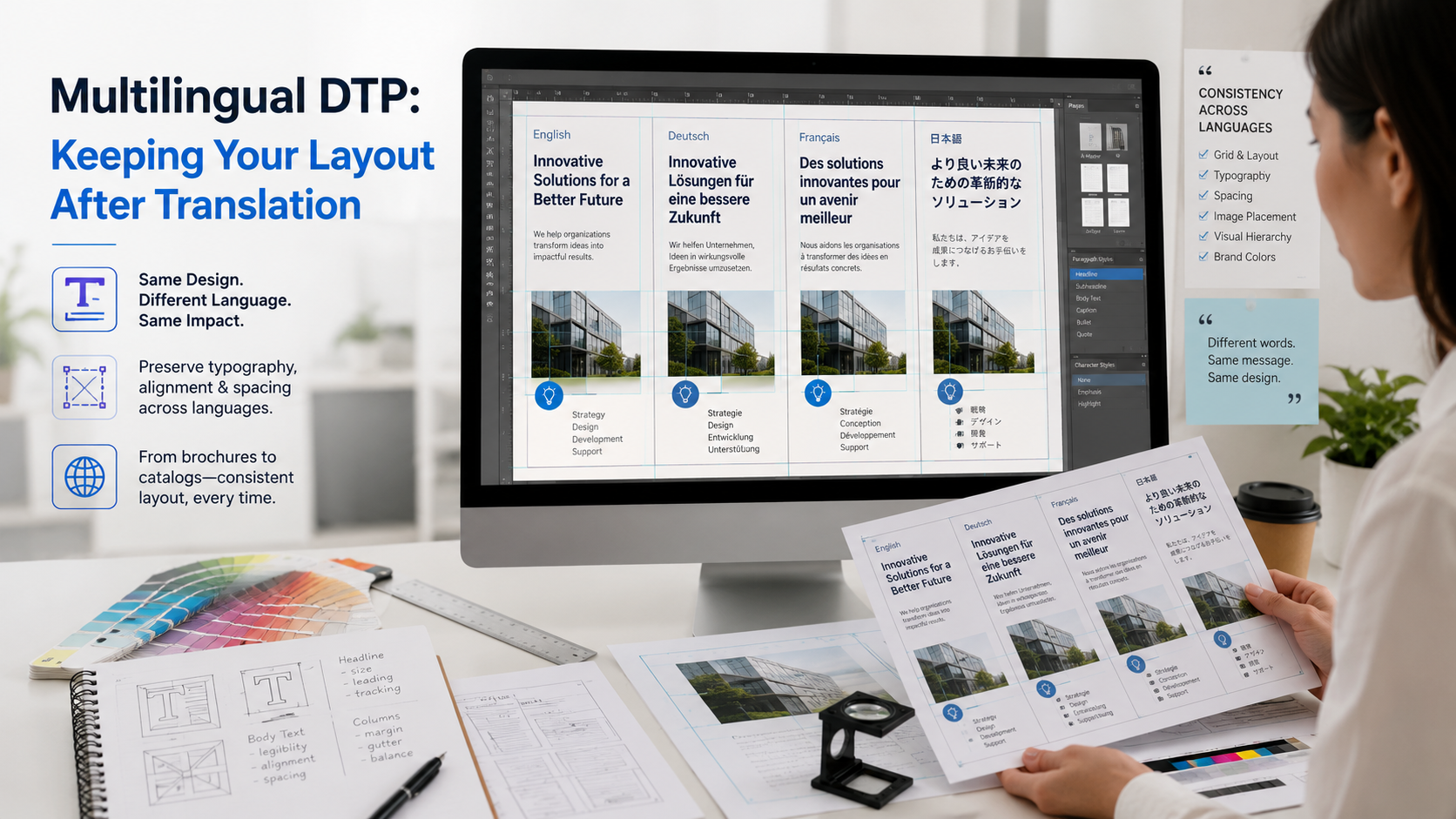
The purpose of multilingual DTP is not to redesign the document from scratch.
It is to preserve the source document’s visual hierarchy and brand identity
while making the translated version work properly in the target language.
This guide explains the main layout issues that appear after translation
and how organizations can prepare files for an efficient multilingual DTP workflow.
What Matters Most in Multilingual DTP?
Text Expansion
Translated text can be longer or shorter than the source,
changing line breaks, paragraph height and page balance.
Font Compatibility
The original typeface may not support the target script,
accents or character set.
Visual Consistency
Headings, tables, callouts, images and spacing should remain
visually consistent with the original design.
Final Layout QA
The finished document should be checked for overflow,
broken characters, misalignment and missing content.
Translation Can Change the Geometry of a Page
Layout problems often appear even when the translation itself is accurate.
A translated paragraph may need more lines, which pushes the next section
lower on the page. A short source-language label may become too long for
a button, diagram or table column.
DTP adjusts text frames, spacing, typography and page structure so that
the translated content fits the design without sacrificing readability.
The goal is visual equivalence, not mechanical duplication.
Some adjustments are necessary because languages use space differently.
Text Boxes
Resize or reposition frames where translated content no longer fits.
Line Breaks
Review headings and paragraphs so breaks remain natural and readable.
Page Balance
Adjust spacing so one language version does not appear unusually crowded or empty.
Visual Hierarchy
Preserve the relationship between headings, body text, captions and callouts.
Which Documents Commonly Need Multilingual Layout Work?
Corporate, product and marketing brochures with designed page layouts.
Product tables, specifications, pricing layouts and image-heavy pages.
Instructions, callouts, diagrams, warnings, tables and cross-references.
Charts, figures, headings, tables and structured business content.
Slides with tight text areas, charts, graphics and branded templates.
Flyers, posters, one-pagers, campaign assets and other designed content.
Different Languages Use Different Amounts of Space
A translated sentence may occupy more or less space than the source.
This can affect headings, captions, tables, sidebars and callout boxes
even when the font size remains unchanged.
Shrinking the font aggressively is usually not the best solution.
A better approach is to review the layout, available space, wording,
line breaks and surrounding elements together.
Where space is genuinely fixed, the translation team should know the
constraint before final layout so concise wording can be considered appropriately.
Headlines
Review wrapping, line count and visual emphasis after translation.
Captions
Keep text readable without allowing captions to collide with images.
Buttons & Labels
Use concise wording where space is genuinely limited.
Tables
Adjust column widths or row heights so translated labels remain legible.
Not Every Typeface Supports Every Language
A font that works well for English may not contain the characters
required for Vietnamese, Chinese, Japanese, Korean, Arabic,
Cyrillic or another target script.
Missing glyphs can appear as empty squares, substituted characters
or inconsistent typography. Before final layout begins, the DTP team
should confirm that the selected fonts support all required characters.
When a replacement font is necessary, it should be chosen to preserve
the design intent as closely as practical.
|
SOURCE FILES
Editable Files Make Multilingual DTP Much More Efficient
|
InDesign → Provide packaged source files
Illustrator → Include linked assets and fonts where permitted
PowerPoint → Provide the editable presentation
Word → Keep styles and document structure intact
PDF → Use as visual reference where editable source exists
|
Use the Document’s Style System Instead of Manual Formatting
Well-built source documents often use paragraph styles, character styles,
master pages and other reusable formatting rules.
Preserving these systems makes multilingual versions easier to update
and helps maintain consistency across headings, body copy, captions
and other recurring elements.
Manual formatting should be minimized where a proper style can control
the same visual property more reliably.
Paragraph Styles
Keep heading and body formatting controlled through reusable styles.
Character Styles
Use controlled formatting for emphasis, terminology and special text.
Master Pages
Preserve repeating headers, footers, page numbers and layout elements.
Grid & Alignment
Keep consistent spacing and visual alignment across all language versions.
Dense Layouts Need Special Attention After Translation
Longer translated labels may require wider columns or additional row height.
Keep numbers, units and values aligned with the correct translated label.
Make sure notes remain connected to the correct table or data point.
Translate legends, axes, captions and labels without obscuring data.
Keep fields, instructions and response areas usable after localization.
Adjust text placement where translated labels no longer fit fixed visual spaces.
Some Translation Content Is Hidden Inside Graphics
Infographics, screenshots, diagrams, product labels and marketing images
may contain text that is not part of the main document text flow.
These items should be identified before translation so no visible source-language
text remains in the final localized document.
When editable graphics are available, translated labels can be placed
directly into the artwork while preserving visual relationships.
Infographics
Translate headings, labels, data callouts and supporting text.
Screenshots
Replace interface text where localized screenshots are required.
Diagrams
Keep translated labels aligned with the correct component or process.
Embedded Text
Identify text that cannot be extracted automatically from the layout file.
Some Languages Require More Than Text Replacement
Right-to-left languages can affect reading direction, alignment,
navigation order and the placement of visual elements.
A layout originally designed from left to right may need to be mirrored
or otherwise adapted so the translated document follows the natural
reading experience of the target language.
Directionality should be considered at the document level rather than
treating each text box independently.
Localized Documents Should Still Look Like the Same Brand
Different language versions should preserve the same visual identity
even when typography and spacing require adjustment.
Brand colors, image style, logo placement, hierarchy and recurring
design elements should remain consistent unless the client specifically
requires market-specific creative adaptation.
A multilingual DTP workflow is therefore both linguistic and visual:
content changes, but the document should still feel like the same publication.
Brand Colors
Keep approved color values consistent across language versions.
Logo Placement
Preserve approved logo size, clear space and positioning.
Image Style
Maintain the visual tone and art direction of the source document.
Hierarchy
Keep headings, subheadings and key messages visually recognizable.
|
FINAL LAYOUT QA
The Final PDF Needs a Visual Review, Not Just a Language Review
|
Overflow → Check every text frame
Fonts → Verify target-language characters
Images → Confirm placement and translated labels
Tables → Check alignment and page breaks
Completeness → Compare with approved source
|
Multilingual DTP Workflow
Source Review
Review editable files, fonts, linked assets, reference PDF and target languages.
Translation Integration
Place approved translated content into the source layout or localization workflow.
Layout Adjustment
Correct text flow, typography, tables, graphics, spacing and page structure.
Visual QA & Delivery
Review the final layout and deliver editable and/or final output files as agreed.
Before Sending a Document for Multilingual DTP
A complete file package helps the DTP team preserve the design
and reduces time spent rebuilding missing source elements.
Related BKMOS Localization Resources
Translation workflow for manuals, SOPs, diagrams,
terminology and technical documentation.
How to choose between controlled translation and
creative adaptation in multilingual campaigns.
Translation, localization and multilingual DTP
for digital and designed content.
Multilingual DTP FAQs
What is multilingual DTP?
Multilingual desktop publishing is the process of formatting translated
content so the target-language document remains readable, visually
consistent and aligned with the original design.
Why does translation affect document layout?
Languages differ in word length, sentence structure, script and typography,
so translated text may require more or less space than the source.
Do you need the original design files?
Editable source files are strongly preferred because they provide
better control over text frames, styles, graphics and document structure.
Can text inside graphics be translated?
Yes, when the graphics can be edited or recreated appropriately.
Embedded image text should be identified as part of the project scope.
What if the original font does not support the target language?
A suitable multilingual font may need to be substituted while preserving
the original typography and visual identity as closely as practical.
What should we send for a quotation?
Send representative files, target languages, editable source files
where available, required output format and the project deadline.
EXPERT REVIEW
Reviewed by Nguyen Dinh Phuc
Founder & CEO of BKMOS. Working in professional translation
since 2005 and responsible for BKMOS’s professional direction,
translation workflows and expert content.
Need Your Translated Documents to Keep Their Original Layout?
Send BKMOS representative files together with the target languages,
editable source files where available, required output format and
delivery deadline. We will review the translation and DTP scope before quoting.
